The Project
This was a school project to design a new logo and collateral for the city of Maple Valley, WA in response to their open RFP.
The Creative Process
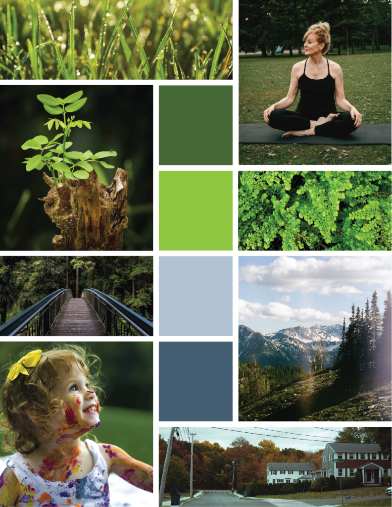
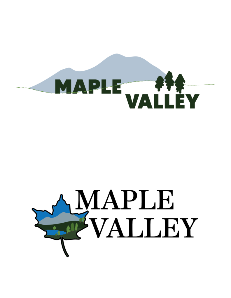
After reading the RFP a mood board focusing on the color, texture and feelings that capture the community feel, connection to nature and prospect of the future. Market research was conducted to better understand what makes Maple Valley special and to pinpoint specific elements to add into the new logo design. A mind map and logo matrix were used to explore a variety of logo elements and the initial concepts for a new logo design were mocked up.
Logo Design
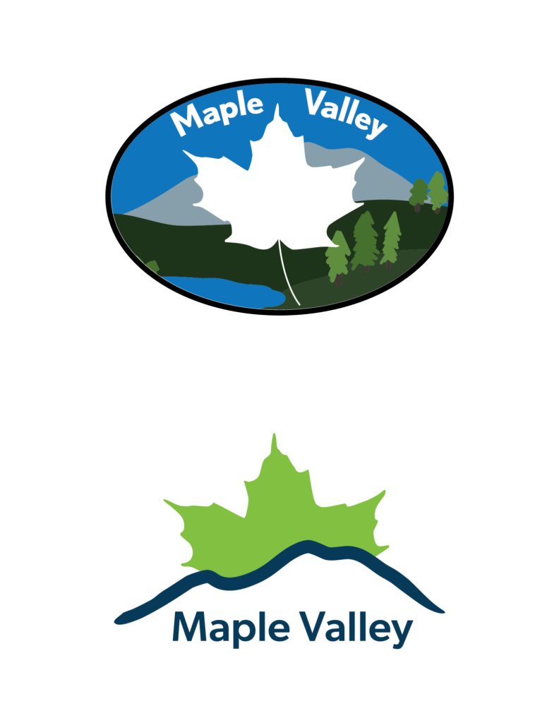
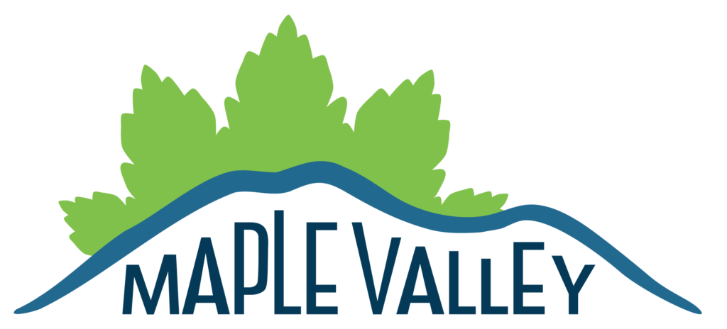
The logo concepts were further developed and a final logo design was chosen. The logo depicts the sun rising over the foothills shining light on the city, connecting the foothills with the community. The sun is at the heart of new beginnings, and the maple leaf sun is no different signifying growth and expansion in Maple Valley. The mountains convey the beautiful natural backdrop of the Cascade Foothills but also root the future of Maple Valley to the strength of the community and local businesses. The logo design is clean, fresh and inviting, just like the city of Maple Valley.
Style Guide Elements
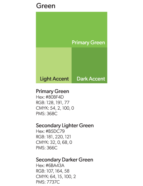
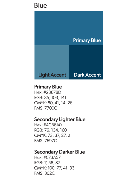
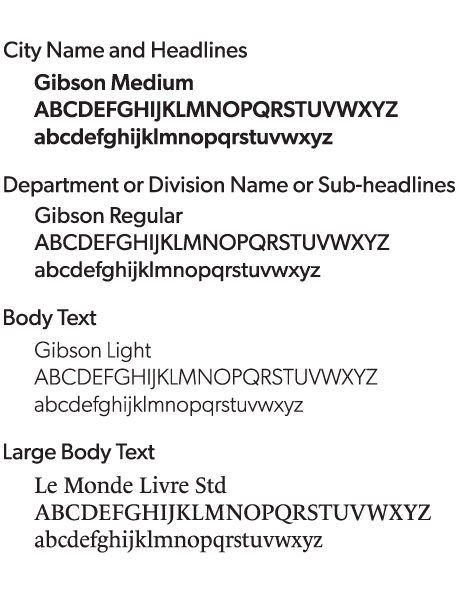
A style guide was developed to go with the new logo. Using color theory and typography the chosen logo elements depict all the promise waiting in Maple Valley with the chosen colors of green and blue.
Green: While bright, earthly and inviting the green focuses on the new growth and opportunities waiting in Maple Valley. It represents the warm community, both residential and industrial, and links them together with the parks, greenspaces, and surrounding wilderness areas that make Maple Valley unique.
Blue: Strong, steadfast and friendly the blue connects the heart of Maple Valley to the surrounding rivers, lake and mountains. It signifies the strong bonds created within the community between neighbors and local businesses that makes Maple Valley a safe and friendly place to call home.
Marketing Collateral
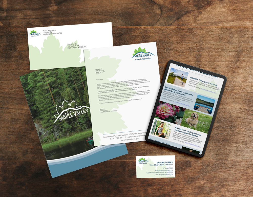
To showcase the full branding package a variety of marketing materials were created. Focusing the the parks and greenspaces a brochure and digital newsletter were developed to highlight the new logo elements and to educate the community and near by communities of summer activities. Both of these items work together using a similar flow to keep the branding consistent across all platforms. The vine maple leaf is used as a graphic element to emulate the new logo, making a cohesive theme as well as a visually balancing the layout. The brochure also features a natural organic blue accent running up the cover. This is a graphic element created to further the connection between the logo colors to the rivers and lakes of Maple Valley.
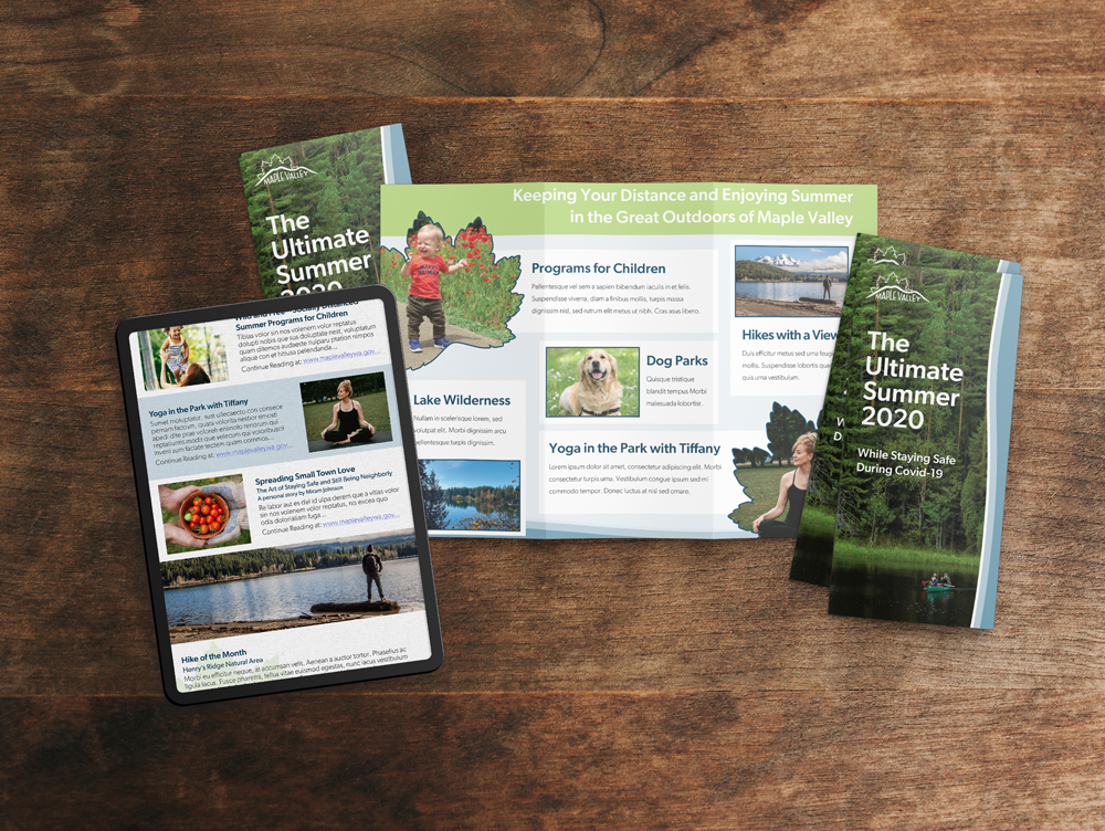
In addition to a brochure and newsletter, business cards, letterhead, envelopes, and portfolio folders were created for the Parks and Recreation department as well. The business cards, letterhead, and envelopes work together to complement each other while providing visual variety. Again the vine maple leaf from the logo is used as a graphic element as well as the movement of the blue water graphics on the folders connecting these marketing materials to the logo as well as the brochure and digital newsletters.
Skills Used
Iconography / Logo Development / Color Theory / Style Guide Creation / Branding Guidelines / Layout Design / Composition / Design Fundamentals / Brochure Design / Adobe Illustrator / Adobe Photoshop / Adobe InDesign
