The Project
Design a logo for a company whose name was randomly generated by two nouns.
Company Name: Mole Mix
Target Audience: Men and women gardeners between the ages of 35-50
Company Overview: Mole Mix is a company and product that can be purchased online and at local garden retailers to help consumers with mole problems in their yard. It is an all-natural soil additive for your garden that humanely discourages mole activity. It can be poured directly into an active mole tunnel or can be worked into the soil as a preventative measure. Mole Mix emits a specific scent that moles do not like and causes them to move to another yard. The scent is undetectable to humans, emitting a subtle scent that only a mole smell. Mole Mix works both as an effective way to convince a current mole to move on as well as to prevent future moles from coming into the soil. It is safe for use on grass, flower beds, and vegetable gardens.
The Creative Process
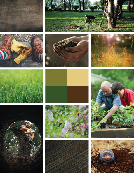
The mood board was created to capture the colors, textures and feel for Mole Mix as well as portray the key terms that should be conveyed to consumers during logo development. Some of the key terms are eco-friendly, hard-working, trustworthy, effective and strong.
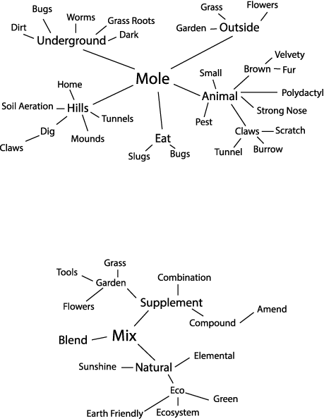
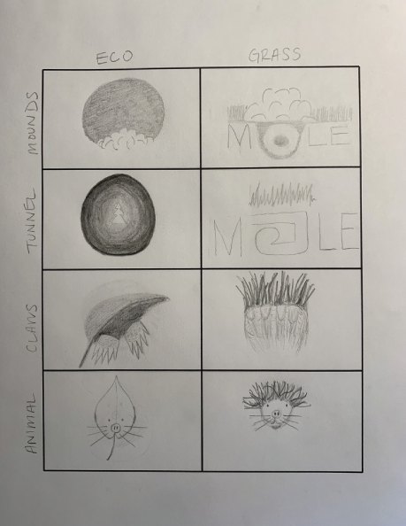
After developing the mood board, a mind map and logo matrix were used to jump start the logo ideation. This allows for several ideas to be sketched out in a short amount of time leading to a variety of designs to potentially develop further.
Logo Development
Moving to the next phase of design the most promising ideas were developed in the digital space and modified to become even stronger. These designs focused on creating a logo conveyed Mole Mix as a trustworthy and hard working brand. By starting only with the colors black and white, it ensured that each concept would be strong and effective as a stand alone logo.
Using the fundamentals of design several concepts were created by making adjustments to the composition, balance, symmetry and negative space. Keeping in mind the words and feelings from the initial development, these designs also play with the above ground/below ground aspect of the relationships between moles and humans.
Through market research and online testing of these initial designs three logo designs were chosen to develop further.
Top Three Logo Designs
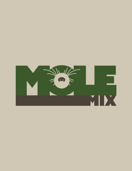
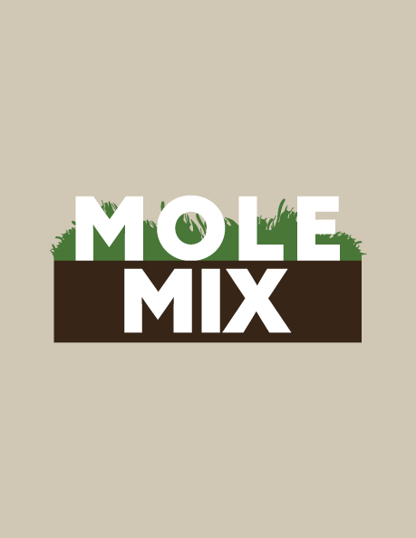
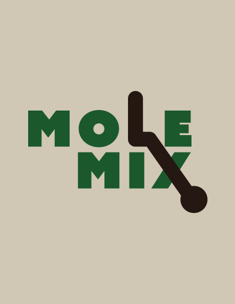
Three unique style logos were presented all conveying the target key terms of eco-friendly, hard-working, trustworthy, effective and strong but were also different from each other.
The first design is playful and fun featuring a cartoon mole in the negative space of the “O”. The mole nose is seen peeping out of the mole tunnel again playing up the above and below relationship. The colors chosen for this design are more warm and neutral, appealing to a wide audience while still portraying Mole Mix as natural and effective.
The second design is more modern and literal. Again it features the above and below ground relationship in a more obvious way with the word Mole resting on the top of the soil and the word mix below in the dirt. The colors are vibrant, rich garden colors solidifying that Mole Mix is strong, humane modern solution for mole prevention.
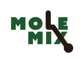
The third design is more abstract in nature. It features a joined “L” with the cross bar of the “X” that together create a mole tunnel and burrow. This design is less limiting and can grow with the company as they expand and develop new product lines. The mole tunnel created can be used as an icon or a symbol used to enhance marketing materials. The colors more neutral portraying hard-working and effectiveness and can still maintain effectiveness with company growth.
Final Logo Design
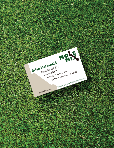

Skills Used During Project
Design Fundamentals / Composition / Logo Exploration / Mind Mapping / Hand Sketching / Logo Matrix / Iconography / Market Research / Letter Art / Work Marks / Color Theory / Adobe Illustrator / Adobe Photoshop